What Is Diagnostic Visualization for A&E Projects
What Is Diagnostic Visualization for A&E Projects
TL;DR:
- Diagnostic visualization converts complex facility data into visual formats that enable faster, more accurate interpretations in architecture and engineering.
- It enhances trust and accuracy by using explainable AI techniques and layered visuals, reducing cognitive load and increasing professional confidence.
- These tools support all project phases, from risk assessment and defect detection to federal compliance reporting, improving decision-making and project outcomes.
Diagnostic visualization is the structured translation of complex diagnostic data into purposeful visual formats that enable architects, engineers, and project decision-makers to identify failure points, compliance gaps, and structural risks before they become construction commitments. In architecture and engineering, this practice operates under the broader discipline of Architectural Diagnostic Intelligence™, where raw facility data transforms into spatial, color-coded, and three-dimensional representations that compress interpretation time and sharpen judgment. Modish Global Inc. built its entire Cinematic Intelligence™ engine around this principle: that seeing a problem clearly is the prerequisite to solving it correctly. The stakes in federal and commercial facility work are too high for any other approach.
What is diagnostic visualization and why it matters in A&E
Diagnostic visualization is defined as the deliberate use of visual encoding techniques to represent diagnostic findings in a format that the human visual system can interpret faster and more accurately than raw data alone. For architecture and engineering professionals, this means converting structural assessments, code compliance audits, and environmental failure data into spatial maps, 3D overlays, and color-graded models that communicate risk at a glance.

The importance of diagnostic visualization becomes concrete when you consider what it replaces. Traditional data analysis in A&E projects produces spreadsheets, written reports, and numerical outputs that require significant cognitive effort to interpret. Visually intelligent design directly reduces cognitive load and accelerates interpretation, which in high-stakes federal procurement or pre-bid evaluation translates to fewer errors and faster decisions.
Modish’s 3D Transformative Digest™ distributes architectural intelligence across ZINIO, PressReader, Magzter, SyndiGate, and Newstex to over 3 million readers in 150 countries precisely because the field recognizes that visual communication of diagnostic findings is now a professional standard, not a premium feature. The question is no longer whether to visualize diagnostic data. The question is how precisely and how transparently.
What are the core diagnostic visualization techniques used in A&E?
The most effective diagnostic visualization techniques in architecture and engineering share one design principle: they exploit pre-attentive visual attributes including color, shape, size, orientation, and spatial position, which the human visual system processes in under 250 milliseconds before conscious attention engages. This means a well-designed heatmap communicates structural stress concentration faster than any written summary.
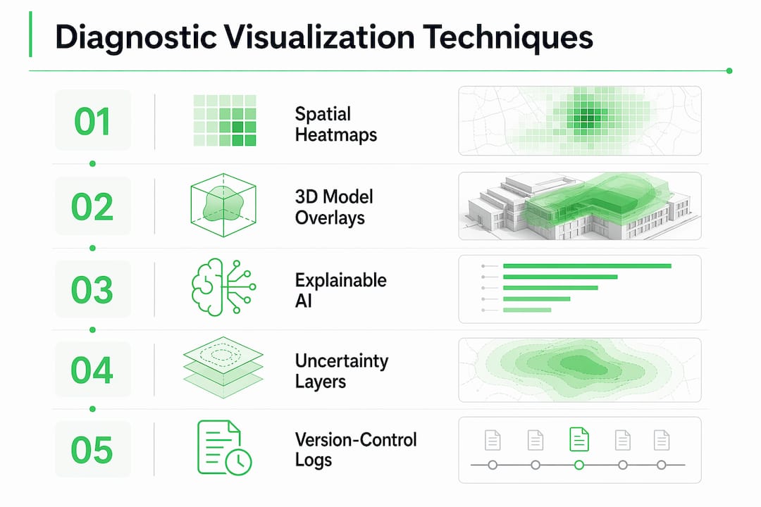
The primary techniques used in Architectural Diagnostic Intelligence™ workflows include:
- Spatial heatmaps and color coding: Applied over floor plans or site models to indicate severity zones for code violations, structural load anomalies, or environmental hazards. Modish’s DesignVault 3D™ renders these at federal submission grade.
- 3D model overlays: Diagnostic findings are projected onto building information models, allowing project teams to locate defects in three-dimensional context rather than interpreting abstract coordinates.
- Multiplicity Modeling™: Modish’s proprietary approach to multimodal data fusion, which layers structural, environmental, and compliance data into a single navigable visual output with 192 corrective visualization options per Space.
- Explainable AI (XAI) visualizations: Techniques including saliency maps, Grad-CAM, LIME, and SHAP highlight which features of a facility scan drive a diagnostic prediction. The GRAPHITE framework demonstrates this approach in histopathology with an AUROC of 0.94, and the same interpretability logic applies directly to AI-driven architectural diagnostics.
- Attention mechanism overlays: These show where an AI model focused during analysis, giving engineers a transparent audit trail rather than a black-box score.
Pro Tip: When reviewing any AI-generated diagnostic output, require that the visualization includes an uncertainty layer. A clean result with no uncertainty indication is a design flaw, not a sign of confidence.
The design of these visuals is not cosmetic. Poor visualization design increases cognitive load and impedes interpretive speed, which in a federal A&E context can delay submissions or introduce compliance errors that cost far more than the diagnostic engagement itself.
How does diagnostic visualization improve accuracy and trust?
Visual diagnostic methods outperform purely statistical or automated outputs in both accuracy and professional trust. Expert visual interpretation of [18F]FDG PET/CT imaging for giant cell arteritis achieves 96.0% specificity, compared to semiquantitative automated methods that peaked at 58.9% specificity. This gap is not a medical anomaly. It reflects a universal principle: trained professionals interpreting well-designed visuals outperform systems that produce scores without spatial or contextual grounding.
The trust dimension is equally critical. Clinician distrust of black-box AI is directly mitigated by explainable AI visualization techniques that show how a model reached its conclusion. For A&E professionals reviewing federal facility diagnostics, the same dynamic applies. A visualization that shows where a code compliance failure occurs and why the model flagged it earns adoption. A score without spatial context does not.
| Approach |
Accuracy indicator |
Trust mechanism |
| Expert visual analysis |
96.0% specificity (PET/CT study) |
Spatial context, professional pattern recognition |
| Semiquantitative automated |
58.9% specificity (same study) |
Score output only, no spatial grounding |
| Explainable AI (XAI) visualization |
AUROC 0.94 (GRAPHITE framework) |
Saliency maps, attention overlays, audit trail |
| Black-box AI output |
High predictive power, low adoption |
No interpretability, no trust calibration |
“Diagnostic visualization tools must align with professional diagnostic reasoning rather than merely providing output scores to gain real-world adoption.” — GRAPHITE research team
The table above makes the strategic case plainly. Accuracy and trust are not separate goals. Visualization is the mechanism that achieves both simultaneously.
What are the practical applications of diagnostic visualization in A&E projects?
The applications of diagnostic visualization in architecture and engineering span the full project lifecycle, from pre-bid evaluation through master planning and federal submission. Concrete use cases where visual diagnostic intelligence changes project outcomes include:
- Pre-construction risk identification: Modish’s Cinematic Intelligence™ engine analyzes facility Spaces before design commits, rendering structural, environmental, and code compliance failure points in federal submission-grade visuals. This prevents costly redesigns after construction begins.
- Defect detection and quality assurance: Diagnostic visualization tools applied to construction progress monitoring identify deviations from specification in real time, giving project managers a spatial record of where and when defects emerged.
- Federal compliance reporting: Interactive 3D visualizations generated through DesignVault 3D™ meet federal submission standards and give contracting officers a transparent, navigable record of facility condition. This is not a convenience. It is a procurement requirement on many federal A&E pursuits.
- Master planning and scenario modeling: Multiplicity Modeling™ layers multiple diagnostic datasets into a single visual output, allowing decision-makers to compare corrective scenarios before committing budget. The step-by-step diagnostic workflow Modish uses for this process is documented for A&E teams.
- Project coordination and real-time decision-making: Construction coordination improves measurably when all project stakeholders reference the same visual diagnostic record rather than interpreting separate data streams.
Pro Tip: Request that your diagnostic visualization output includes a version-controlled visual log. On federal projects, this log becomes part of your past performance documentation and strengthens future proposal submissions.
How do emerging technologies enhance diagnostic visualization capabilities?
Deep learning models demonstrate powerful predictive abilities in facility diagnostics, but face deployment challenges due to lack of standardized protocols, computational cost, and qualitative-heavy evaluation criteria. This is the exact gap that purpose-built Architectural Diagnostic Intelligence™ infrastructure addresses. General-purpose AI tools were not designed for federal A&E submission requirements or Fortune 500 supplier diversity documentation.
Multimodal data integration closes information gaps that no single diagnostic modality can address alone. Modish’s Multiplicity Modeling™ applies this principle directly: structural data, environmental readings, and code compliance flags are fused into a single navigable visual rather than delivered as separate reports requiring manual synthesis. The result is a diagnostic output that engineers can interpret without requiring data science expertise.
The GRAPHITE framework’s approach to explainable AI in tissue histopathology offers a direct analog for architectural diagnostics. Its graph-based interpretability structure shows not just what the model found, but which spatial relationships drove the finding. Modish’s Cinematic Intelligence™ engine applies equivalent logic to facility Spaces, producing 192 corrective visualization options per upload that give A&E teams a decision matrix rather than a single opaque recommendation.
Key takeaways
Diagnostic visualization in architecture and engineering converts raw facility data into spatial, layered visuals that improve decision accuracy, reduce cognitive load, and satisfy federal submission standards simultaneously.
| Point |
Details |
| Definition is precise |
Diagnostic visualization translates diagnostic data into visual formats that accelerate expert interpretation and reduce errors. |
| Visual methods outperform scores |
Expert visual analysis achieves 96.0% specificity versus 58.9% for automated semiquantitative methods in comparable studies. |
| Trust requires transparency |
Explainable AI visualizations including saliency maps and attention overlays are required for professional adoption, not optional. |
| Applications span the full lifecycle |
From pre-bid risk identification to federal compliance reporting, visualization applies at every A&E project phase. |
| Standardization gaps are real |
Lack of standardized protocols and computational cost remain barriers that purpose-built Architectural Diagnostic Intelligence™ infrastructure resolves. |
Why calibrated visualization beats confident-looking outputs
The most dangerous diagnostic visualization is the one that looks authoritative but hides its uncertainty. I have reviewed facility diagnostic outputs from general-purpose AI tools that presented clean, color-coded risk maps with no indication of data gaps, model confidence intervals, or edge cases. Those outputs did not fail because the AI was wrong. They failed because the visualization was designed to project confidence rather than support judgment.
Diagnostic visualization success depends on calibrating trust rather than maximizing it. Interfaces must surface data gaps and uncertainty explicitly to prevent overconfidence in high-stakes decisions. For a federal contracting officer reviewing a facility assessment, or a Fortune 500 project director approving a master plan, an honest visualization that shows what is known and what is uncertain is worth more than a polished output that obscures both.
Modish’s position as the only Disability:IN-certified DOBE in Architectural Diagnostic Intelligence™ is not incidental to this philosophy. Designing for clarity, accessibility, and honest representation of complexity is built into the firm’s operating model. The benefits of architectural diagnostics are only realized when the visualization earns the trust of the professionals who act on it.
— Ben
How Modish delivers diagnostic visualization for A&E teams
Modish Global Inc. is the only Disability:IN-certified DOBE architectural diagnostic intelligence firm in the United States, and its Cinematic Intelligence™ engine was built specifically for the visual diagnostic demands of federal and Fortune 500 A&E work.
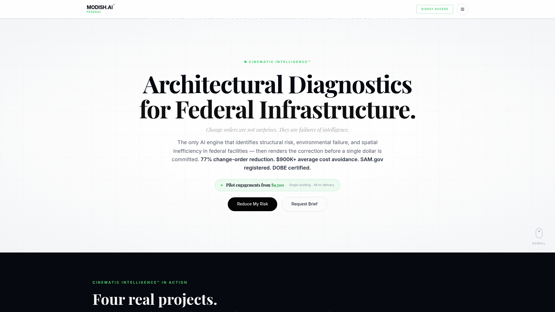
Every Modish engagement produces federal submission-grade visualizations through DesignVault 3D™ and Multiplicity Modeling™, with 192 corrective visualization options per Space and full SAM.gov registration for federal teaming. Engagements begin at $9,500 for single-facility pilots and scale to $150,000+ enterprise licenses. For procurement teams, every dollar counts as Tier 1 diverse spend credit. Explore the full range of Architectural Diagnostic Intelligence™ services or review service and pricing details to match your project scope.
FAQ
What is diagnostic visualization in simple terms?
Diagnostic visualization is the process of converting complex diagnostic data into structured visual formats, such as heatmaps, 3D overlays, and color-coded spatial maps, so that professionals can identify problems faster and with greater accuracy than raw data allows.
How does diagnostic visualization work in architecture projects?
In architecture, diagnostic visualization works by processing facility data through AI-driven engines like Cinematic Intelligence™ and rendering the findings as navigable 3D models with layered compliance, structural, and environmental indicators that project teams can review before construction commits.
What are the main types of diagnostic visualization?
The primary types include spatial heatmaps, 3D model overlays, explainable AI visualizations such as saliency maps and Grad-CAM outputs, attention mechanism overlays, and multimodal fusion models like Multiplicity Modeling™ that combine multiple data streams into a single visual output.
Why is explainable AI important for diagnostic visualization?
Explainable AI techniques including saliency maps, LIME, SHAP, and Grad-CAM show which features drove a diagnostic prediction, giving professionals a transparent audit trail instead of an opaque score. This transparency is what converts AI output into professional trust.
Modish is the only Disability:IN-certified DOBE in architectural diagnostic intelligence, and its Cinematic Intelligence™ engine produces 192 corrective visualization options per Space at federal submission grade. No general-purpose AI tool is structured for FAR compliance, DOBE diversity scoring, and Architectural Diagnostic Intelligence™ simultaneously.
Recommended